MKB
Brand Identity • UI/UX
OBJECTIVE
MKB is a North American specialized private investment firm focused on leading the energy transition. For over a dozen years, MKB has provided growth capital to companies at the forefront of climate innovation. They called for a brand refresh and a new website showcasing innovation, progressiveness, and optimism.
SOLUTION
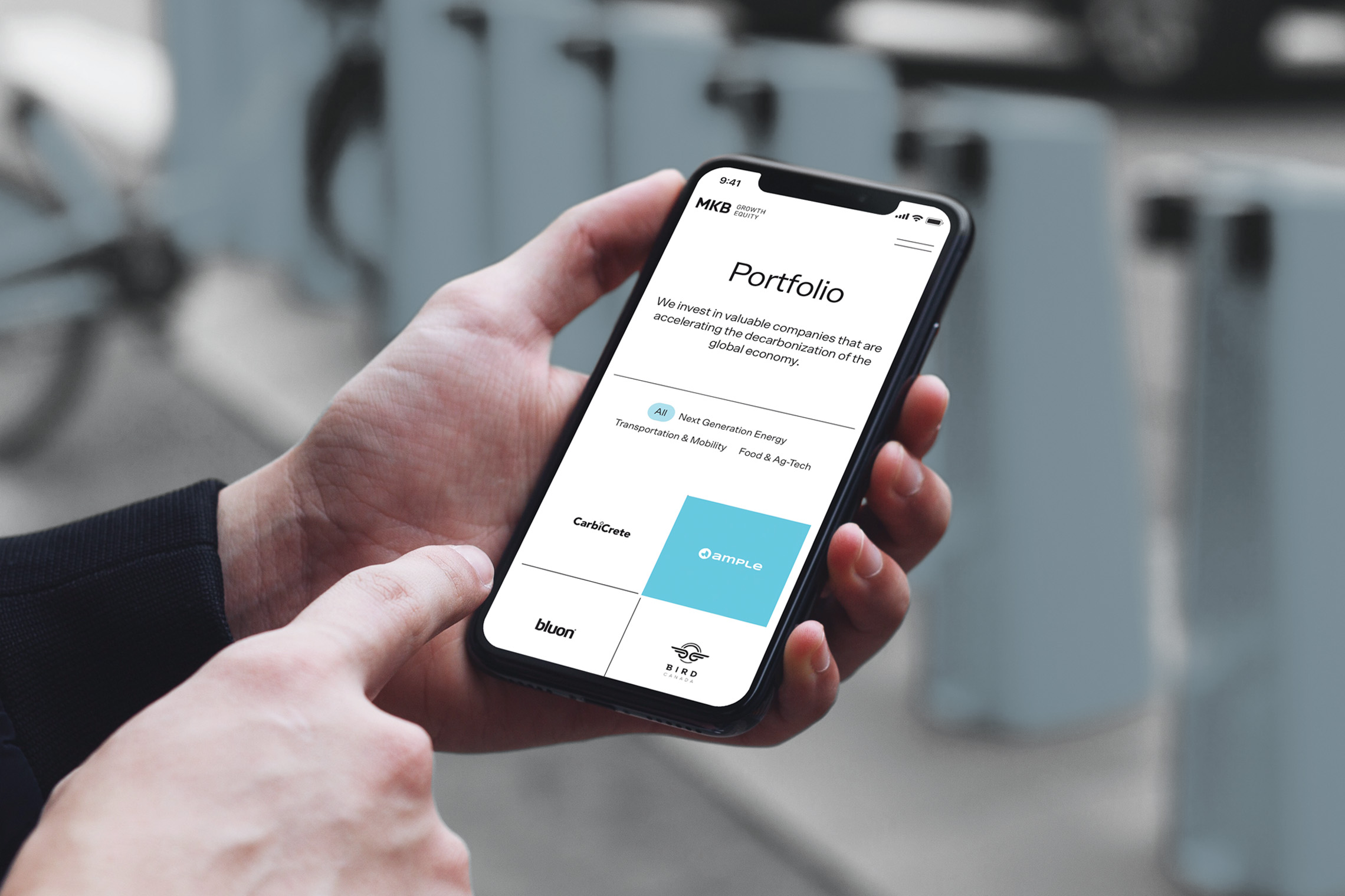
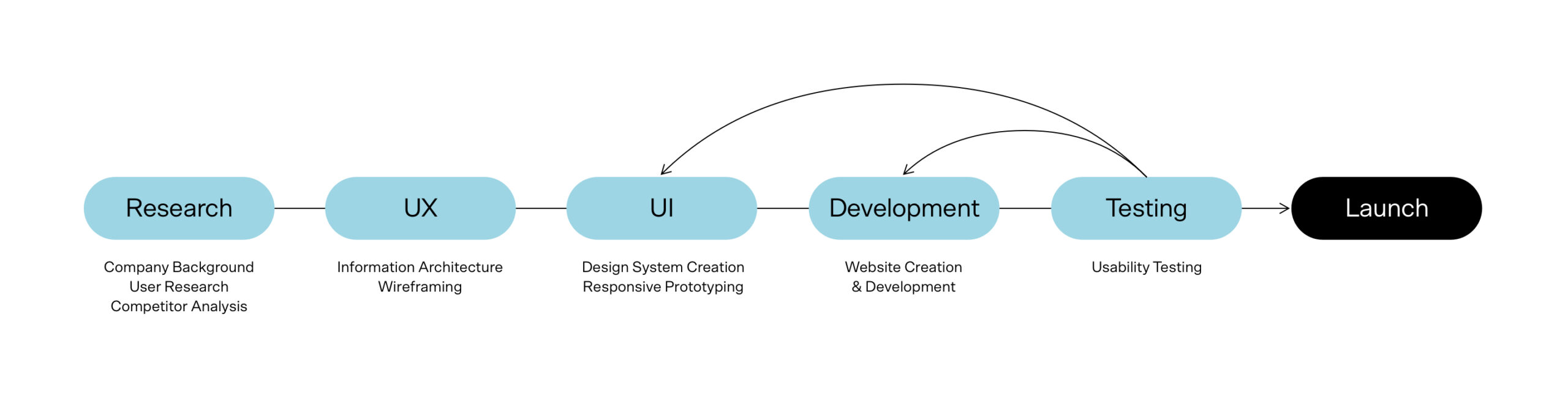
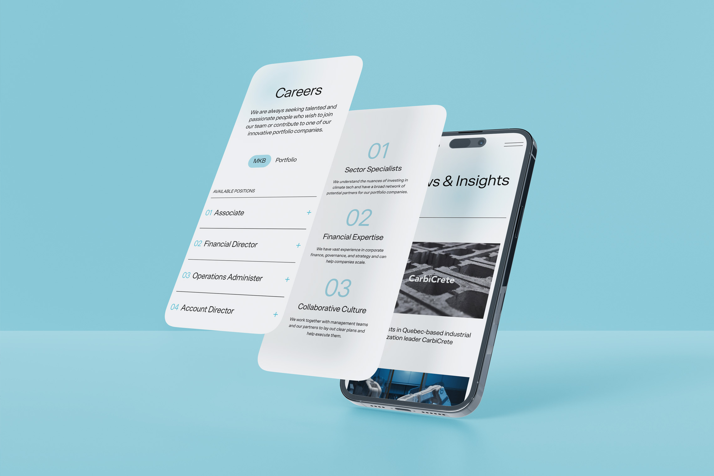
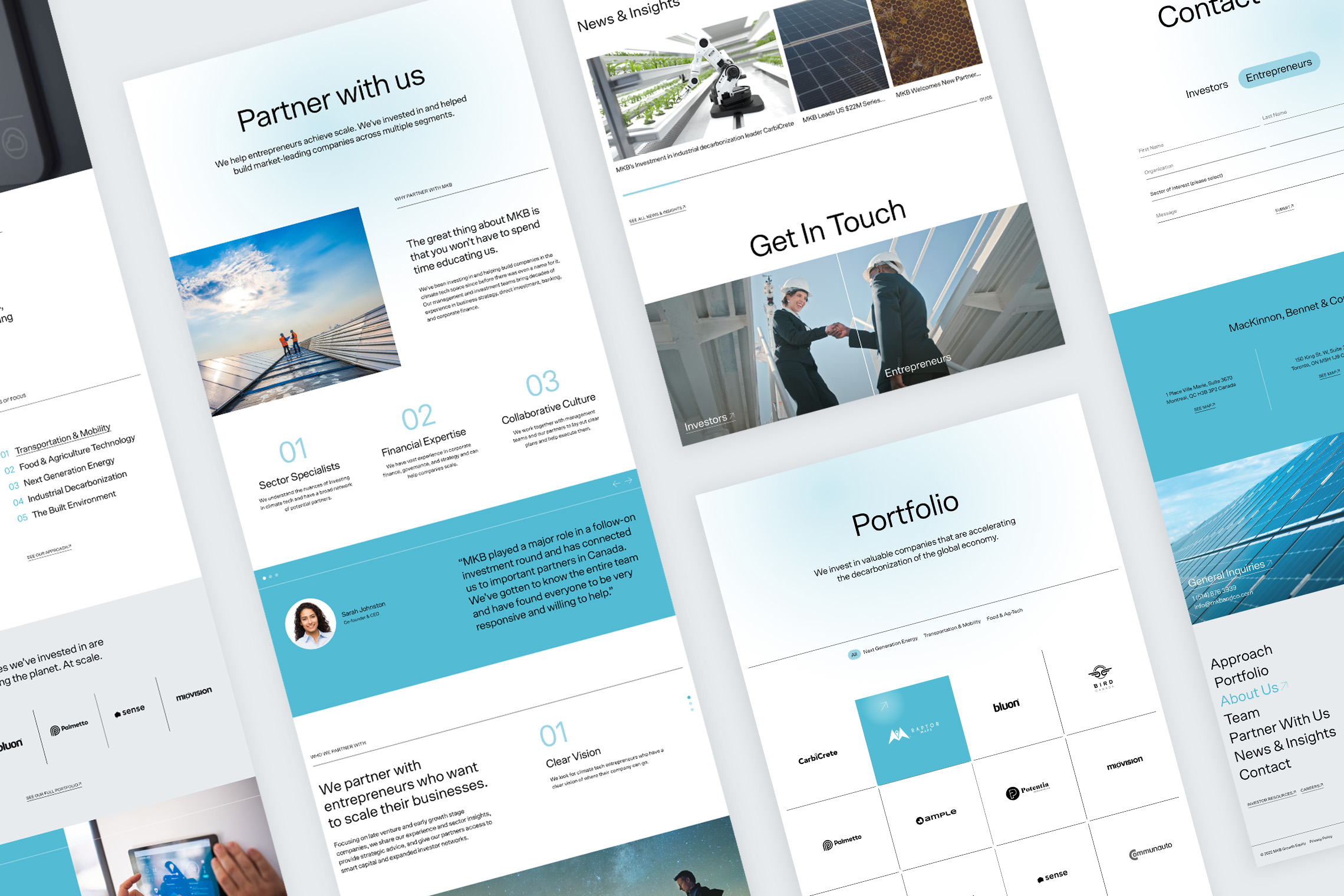
A clear design system needed to be established, and then applied to responsive interfaces. The aesthetics of the brand must reflect decarbonization; honing a light feel. With this in mind, the typeface “Scto Grotesk A” was chosen as it carries an airiness and displays well at large and small sizes; keeping nice typographic hierarchy. The colour palette was refreshed, using primary colours such as black and blues—used minimally—maintaining lots of white space for easy navigation. The outcome of the project used an iterative process, ensuring the site is user-friendly across all devices, giving investors, partners, and entrepreneurs a platform to combat climate change. View the new website here.
Collaborators: Grant Gordon (copy writer), Mackenzie Gilmore (project manager), Seth Singer (web developer)
OTHER PROJECTS
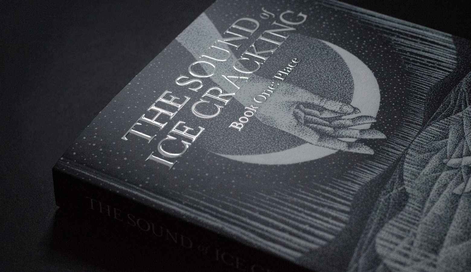
THE SOUND OF ICE CRACKINGBook Design
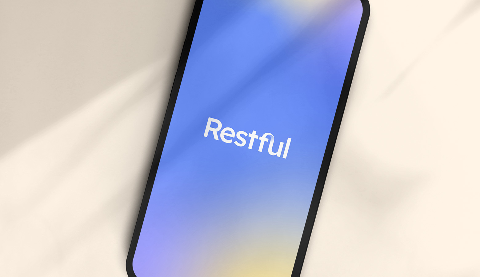
RESTFULDigital Product Design • UI/UX

NOTICEABILITYBrand Identity • UI/UX
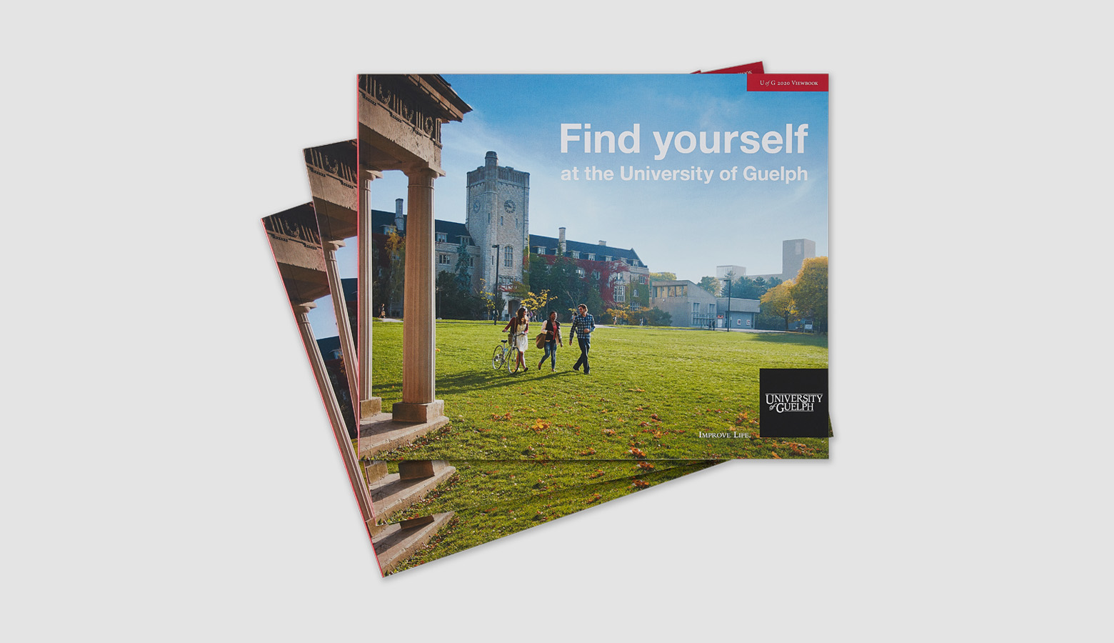
UNIVERSITY OF GUELPHPrint & AODA Design

QUINN+PARTNERSBrand Identity • UI/UX
CONTEMPORARY AUSTRALIAN INDIGENOUS ARTPrint Design

MONTCREST SCHOOLBrand Identity Design
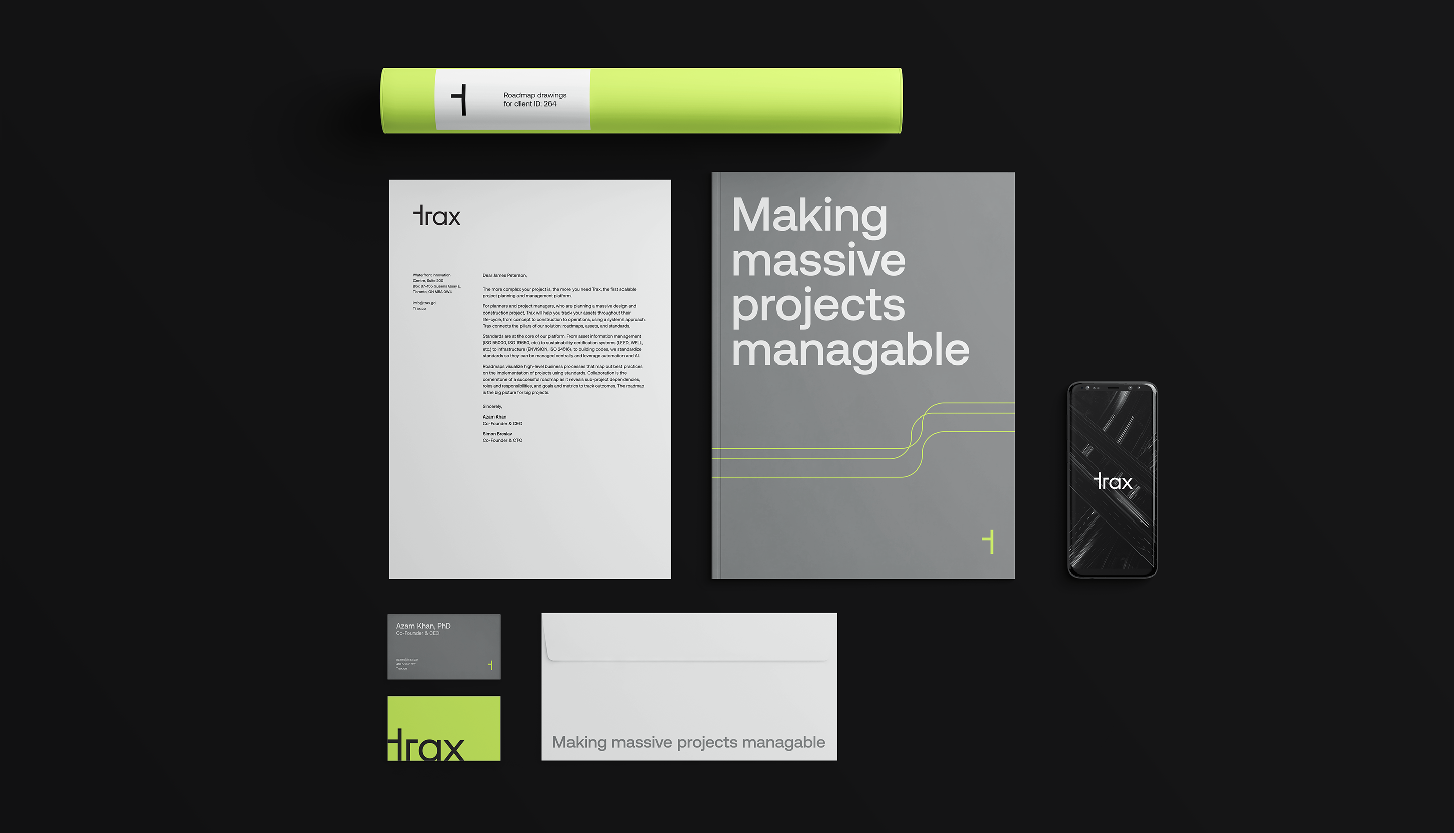
TRAXBrand Identity Design
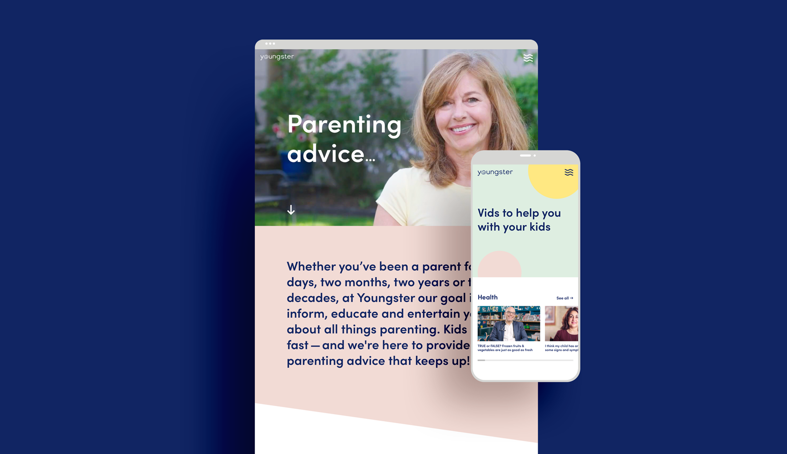
YOUNGSTERBrand Identity • UI/UX
EAT, SLEEP, DESIGN, REPEAT.
© 2023 Renee Robinson