NOTICEABILITY
Brand Identity • UI/UX
OBJECTIVE
NoticeAbility is a nonprofit organization dedicated to helping students with dyslexia thrive by identifying their unique strengths and building self-esteem. NoticeAbility was founded in 2015 by CEO and executive dyslexic, Dean Bragonier. Their goal was to develop a brand identity and website to market their specialized teaching program to dyslexic students surrounding the globe.
SOLUTION
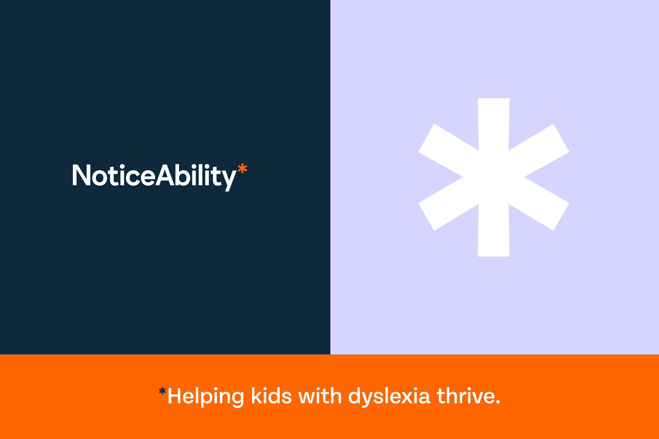
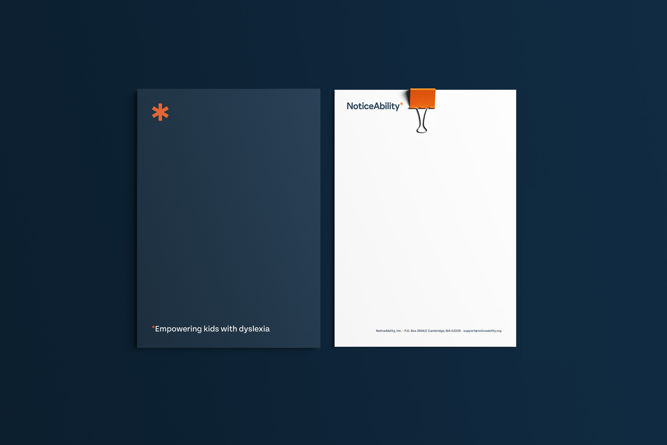
The logo was inspired by gaining empathy with the target audience and understanding the challenges of dyslexia. An asterisk is to represent information that has been omitted or left out from the body. Just like dyslexics, they are often left out of a traditional class because of their different learning style. The horizontal logo and icon include the asterisk, which indicates NoticeAbility’s mission: helping kids with dyslexia thrive.
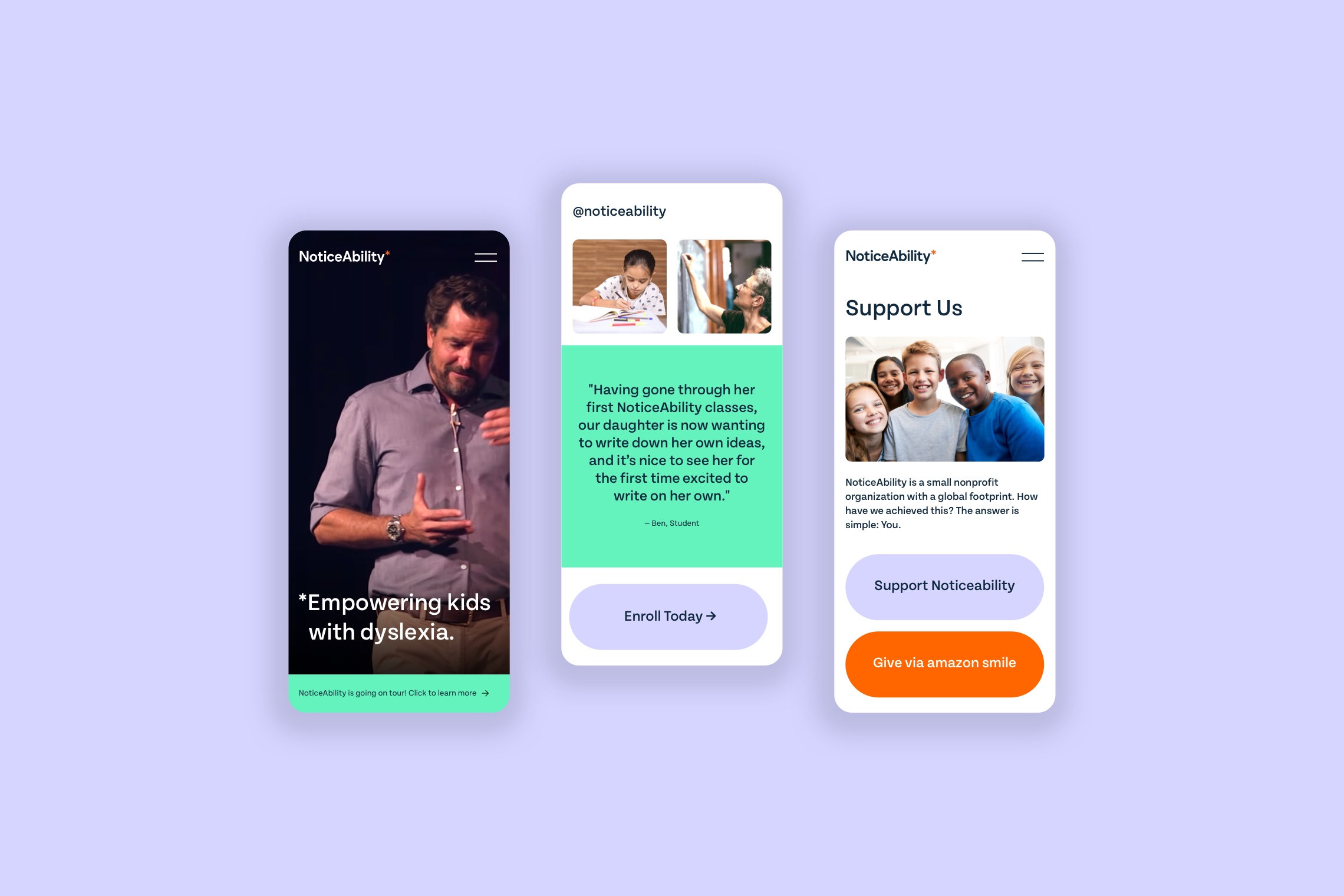
The brand uses “Tenon Medium” for headlines and “Tenon Regular” for body text. These fonts were chosen because of their strong legibility which is extremely important for dyslexics. The client wanted to keep their existing primary brand colours (dark blue and orange) but desired two additional colours to bring vibrance and youthfulness to the brand. The website was designed to be easy to navigate honing a simple aesthetic. The styling incorporates large buttons with minimal copy and flourishes to ensure optimal user experience. View their website here.
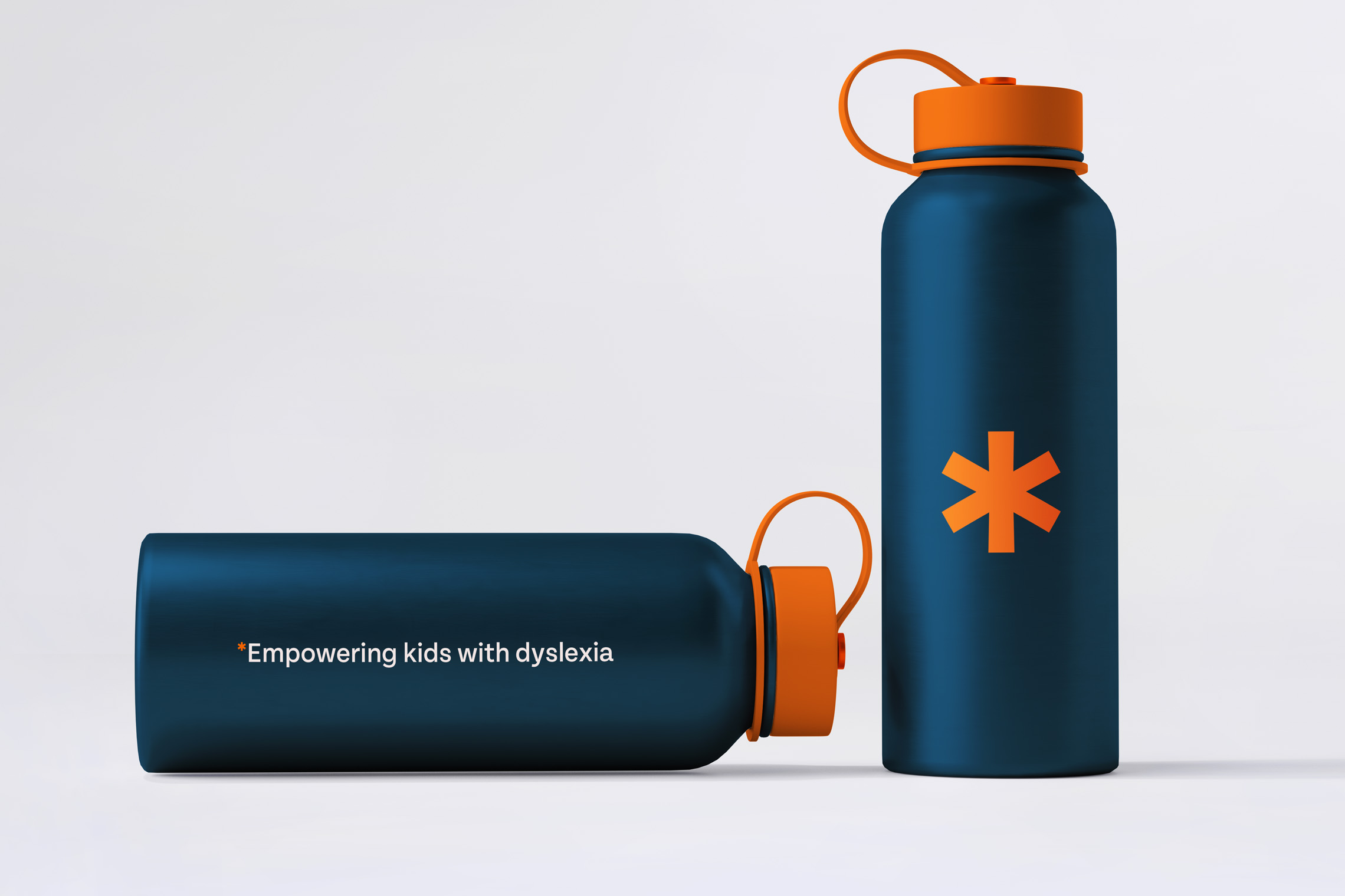
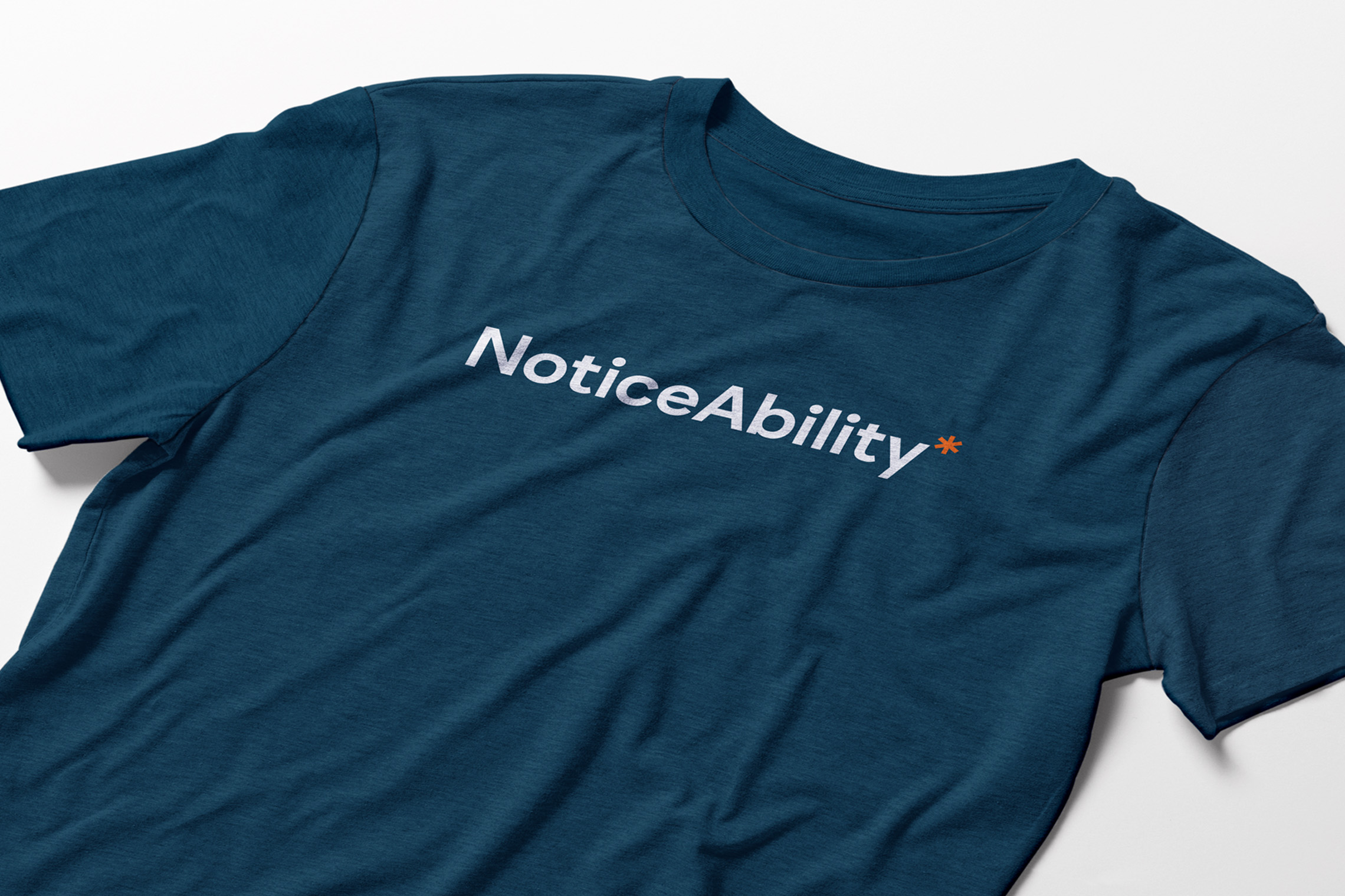
Collaborators: Grant Gordon (creative director & copy writer), Seth Singer (web developer)
OTHER PROJECTS
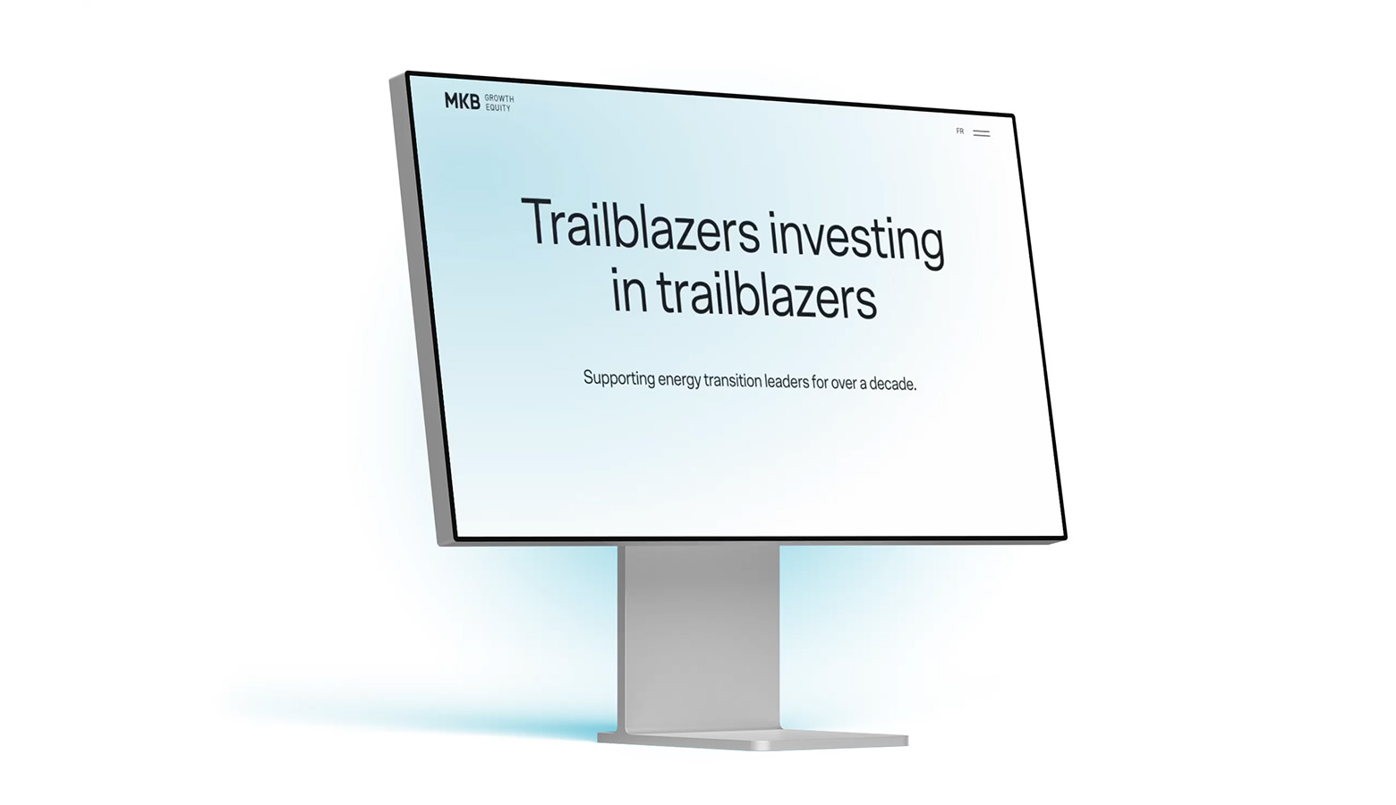
MKBUI/UX Design
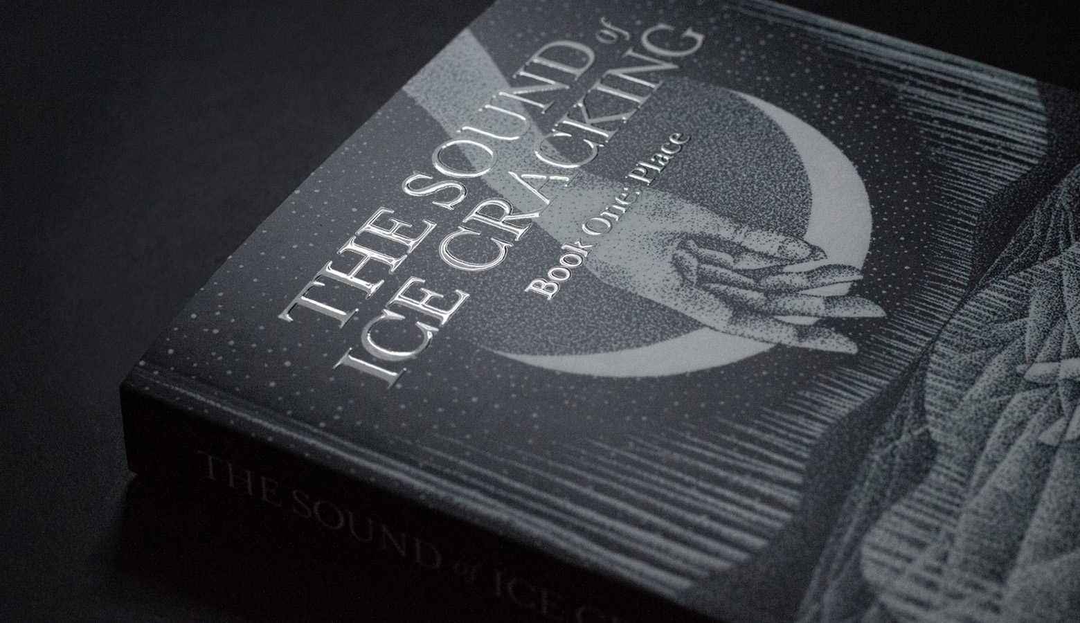
THE SOUND OF ICE CRACKINGBook Design
RESTFULDigital Product Design • UI/UX
UNIVERSITY OF GUELPHPrint & AODA Design
QUINN+PARTNERSBrand Identity • UI/UX
CONTEMPORARY AUSTRALIAN INDIGENOUS ARTPrint Design

MONTCREST SCHOOLBrand Identity Design
TRAXBrand Identity Design
YOUNGSTERBrand Identity • UI/UX
EAT, SLEEP, DESIGN, REPEAT.
© 2023 Renee Robinson